Start with how you want to live, not with listings — explore the map, click any area, or let the 90-second wizard rank all 684 wards around your priorities. Every number comes from named public data; commute times are real routed TfL journeys.
Free to explore — and for a deeper understanding of any area, a Day Pass is £4.99. See pricing ↓
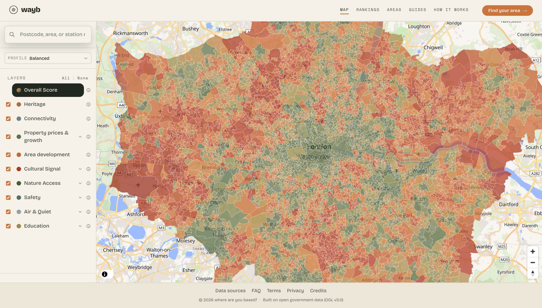
London coloured pocket by pocket — 4,994 pockets across 684 wards, scored on nine layers and recoloured to your priorities, live.
Who it's for
First-time buyers — Find areas in budget that listing sites bury.
Renters — Rank on rent per square foot, commute and what's actually nearby — not just the asking rent.
Families with children — Weigh schools, safety, parks and clean air all at once.
Students & sharers — Find lively, well-connected, affordable areas near your campus or work.
Professionals & commuters — Optimise for the trip to one — or two — workplaces with real TfL journey times, plus culture and walkability.
Downsizers & retirees — Favour heritage, green space and quiet over nightlife.
Relocators & expats — Evaluate London systematically, without local hearsay.
Landlords & investors — Spot momentum — price growth, new development and rising scores.
1
Explore the map — freely
Open the map and start anywhere. Pan and zoom across London’s 4,994 pockets — roughly 1,500 residents each, the finest unit the city is scored by — or search by postcode, street, area or station to jump straight there. Switch between the nine layers, toggle the sub-scores, or pick a preset to tilt the whole city toward what you care about — the map recolours instantly, no reload. It’s all free.
How to read the colours
LowerHigher
One earthy scale runs through the whole product — deep rust at the bottom of the pack, deep olive at the top. Maps and rankings colour by where each area sits in the London-wide spread, so the scale always shows real contrast. The number is always shown alongside the colour.
Pick a preset to tilt the map
The nine layers don’t matter equally to everyone. A preset is a ready-made lens that re-weights them — switch any time, or fine-tune the sub-scores yourself.
Balanced
Equal weight across all dimensions — no strong opinion, just the full picture
Culture Vulture
Lives for London's energy — gigs, galleries, restaurants
Heritage Lover
Georgian terraces, conservation areas, tree-lined streets
Family Nest
Schools, safety, clean air, and parks — kids come first
Elf
Clean air, green space, quiet streets — an urban retreat
Young Professional
Good commute, social life, and affordable rent
Up & Coming
Development on the way and prices still moving — in before it's obvious
Smart Value
The most London for your money, with the basics intact
2
Click any area to see why it scores
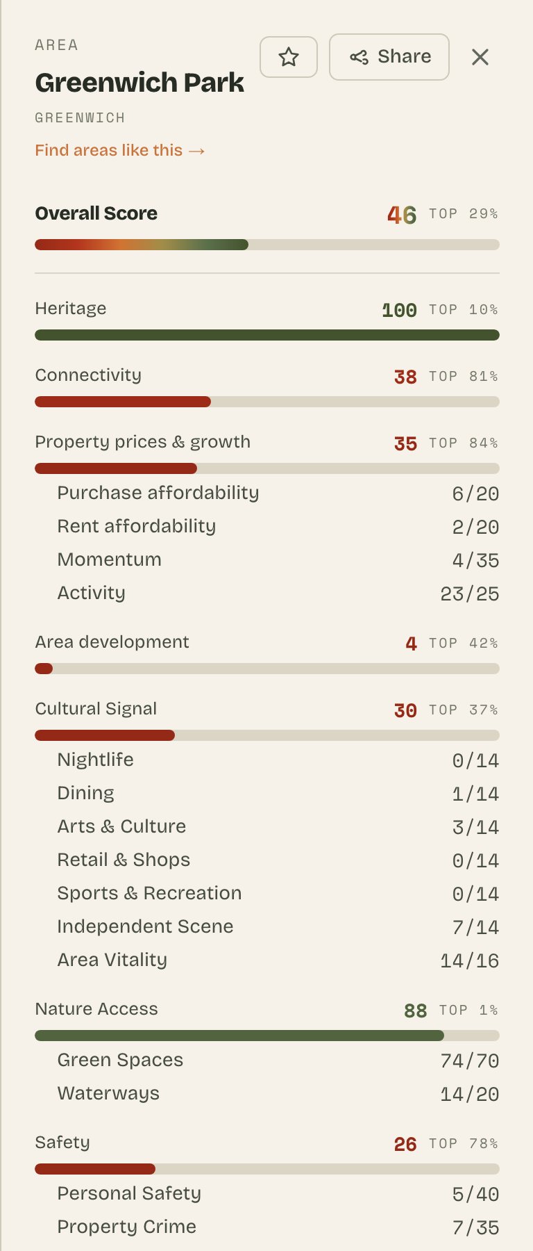
Tap any neighbourhood and a panel slides in with its overall score and the full breakdown — every one of the nine layers and the sub-scores beneath them, coloured on the same scale as the map. Open the full ward profile for the written summary, listed buildings, the layer-by-layer dossier, and links to explore similar areas.
How to read a score
Every score is built on a 0–100 scale, but London’s areas cluster in the middle of it: the overall score blends nine layers, and no area is best at everything at once, so even the highest-scoring ward lands in the 50s — not the 90s. A 48 is not “48 percent” and it is not a mark out of a hundred.
That is why every score comes with the line that tells you where an area stands: “Better than X% of London”. It places the area against every other one on the map — better than 92% means near the top, better than 20% means most of London scores higher.
Comparing two areas? Scores on the same measure compare directly — a higher Safety score is the safer area, a higher overall is the stronger fit. What you can’t do is compare one layer with another: each layer has its own spread, so a 60 on Education and a 60 on Area development are not the same achievement. The “better than X%” line is what puts every number on that one comparable footing.
Areas with the same score are tied. When several areas share the lowest score, the label says, for example, “Shared lowest band with 24% of London”. That means 24% of areas have the same zero — not that a zero has beaten them. “Lowest in London” and “Highest in London” name the two ends when there is no percentage to add.
Click an area → its overall score and all nine layers, instantly.
How individual layer scores work
Each layer has its own 0–100 scale: higher means more of the quality named by that layer. The London line and bar show its real band in the city-wide spread. A zero is a valid result, not automatically missing data; what it means depends on the layer.
Where the data comes from
Every number on the site traces back to a named, official, public dataset: sale prices from HM Land Registry, street-level crime from the Met Police, school inspections from Ofsted, real journey times from TfL, listed buildings and conservation areas from Historic England, population and rent statistics from the ONS — and more alongside them. Nothing is scraped from listing sites and nothing is opinion-weighted: if a figure is on the map, a public dataset is behind it, and we say which edition.
Scores as of 11 Oct 2026 · prices to 2026 · crime to Jul 2026 · air 2022 · sources
Heritage
Listed buildings and conservation areas density
At zero: Little or no listed-building or conservation-area signal is recorded.
Connectivity
Public transport accessibility (PTAL)
At zero: The area sits in the weakest public-transport-access band.
Area development
Major new developments coming to the area
At zero: Little or no qualifying major development activity is recorded for the scoring window.
Property prices & growth
Property prices, growth and turnover
At zero: The combined affordability, growth and turnover signal is in the weakest band; it does not mean there are no homes.
Cultural Signal
Independent venues, food scene, and cultural diversity
At zero: Very little qualifying venue and local-activity signal is recorded.
Nature Access
Green spaces, waterways, and natural environment
At zero: Very little mapped green-space or water access is recorded.
Safety
Crime rates by type — personal safety, property crime, anti-social behaviour
At zero: The recorded-crime mix places the area in the lowest safety band; it is not missing data.
Air & Quiet
Air quality and noise levels — how clean and quiet it is
At zero: The combined air-quality and quietness signal is in the weakest band.
Education
Primary and secondary school access, weighted by Ofsted rating and distance
At zero: Access to inspected primary and secondary schools is in the weakest band.
3
Or let the wizard narrow it for you
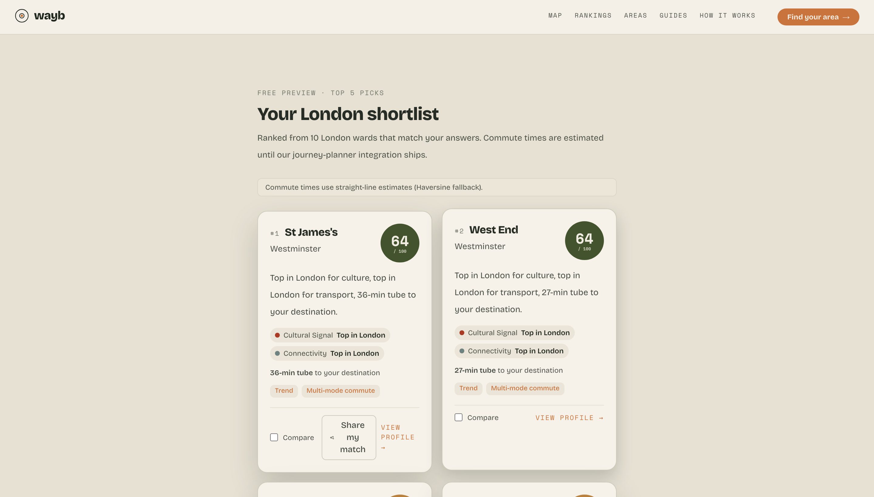
Short on time? Answer the 90-second wizard — where you need to commute (one or two destinations), your budget, the kind of place, what matters most. It’s budget-aware down to the price-per-square-foot, so an £800k budget finds you a real 2-bed, not a Mayfair garage. And the commute times on every pick are real routed TfL journeys — Tube, rail, DLR, Elizabeth line and bus, planned with TfL’s own Journey Planner, not straight-line guesses. Check any pick against TfL’s planner: it should agree within a couple of minutes (and where we don’t yet have a route, we say so on the result). You get a ranked shortlist with plain-English reasons — and when nothing fits, it tells you exactly which answer to loosen.
The wizard ranks every ward against your answers — with the reasons it matched.
Found somewhere you love? Find more like it
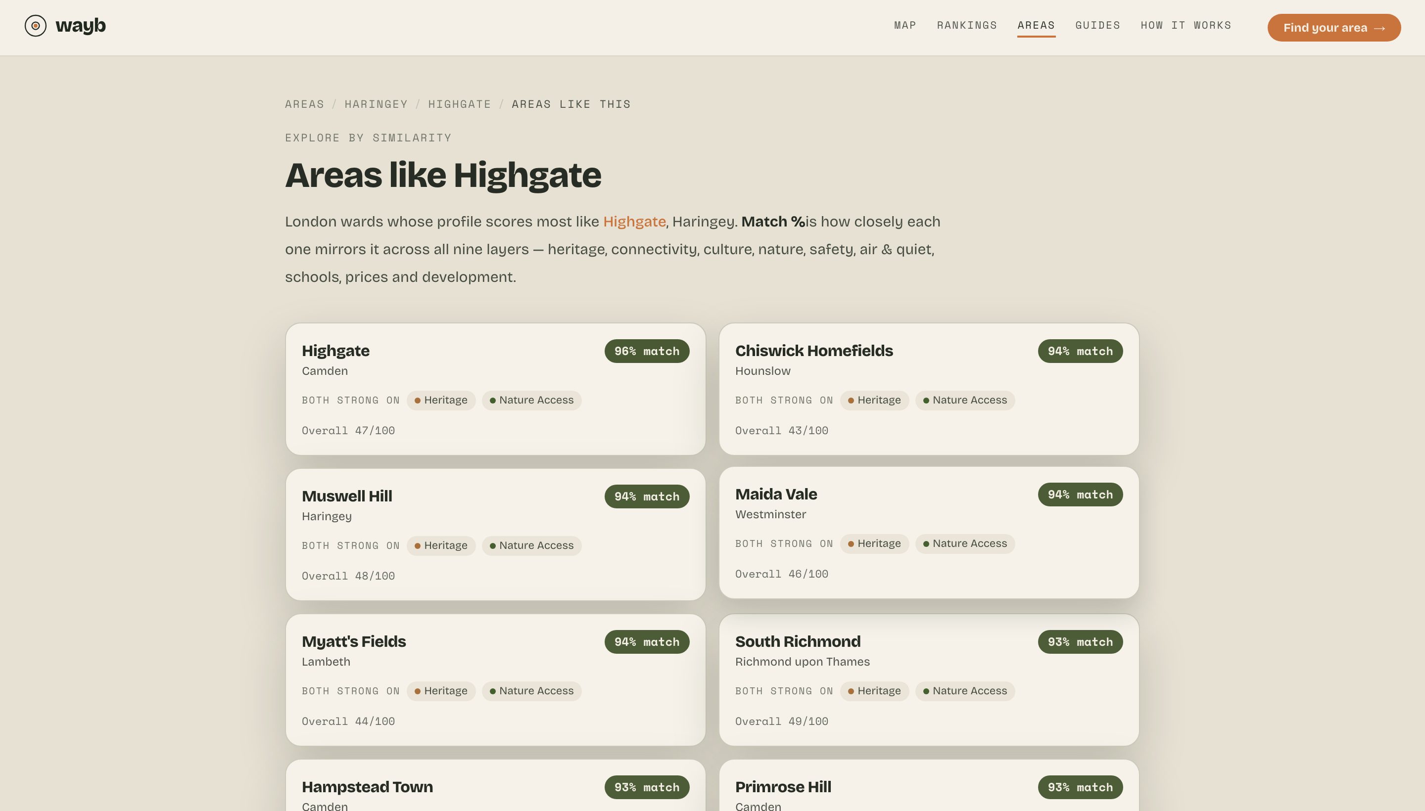
Every ward links to the areas whose profile scores most like it — with a match % and the strengths they share — so you can explore outward from a place you already know. Or type any postcode to put two areas side by side, layer for layer.
“Areas like Highgate” — ranked by how closely each one matches, layer by layer.
Go deeper on any ward
The scores and breakdown are free. When you’re weighing a real decision, unlock the depth that isn’t on the map — the charts, trends and granular data behind each layer, on every ward.
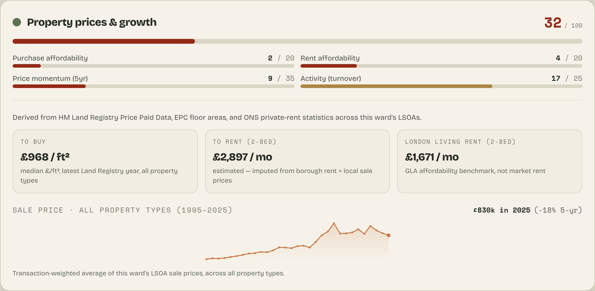
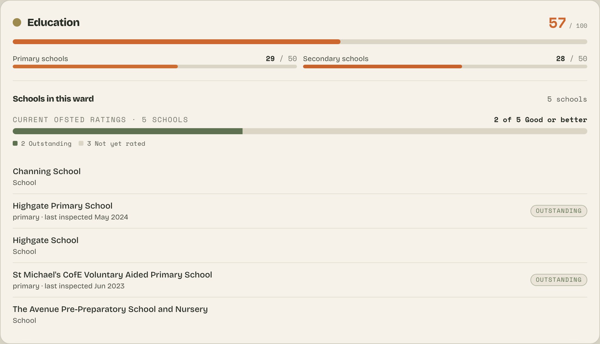
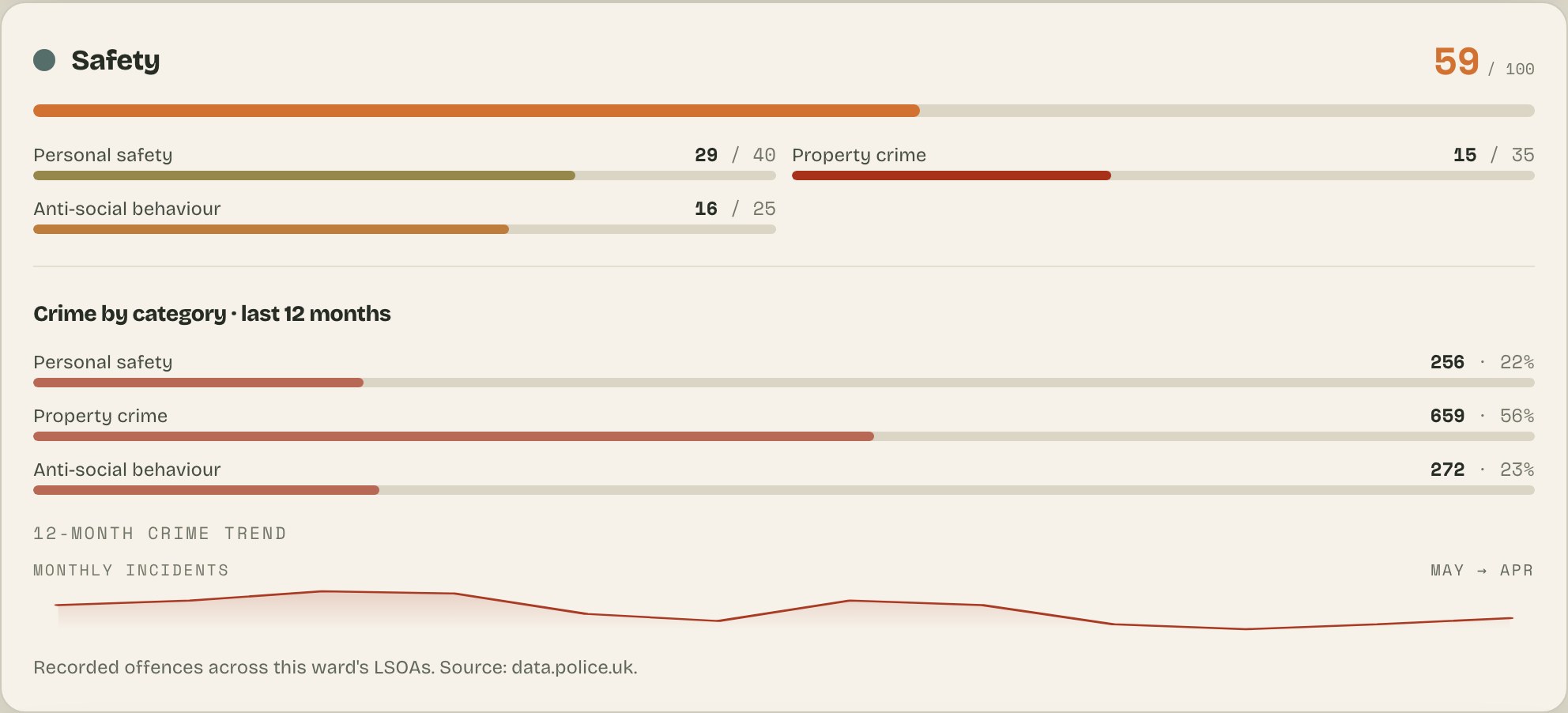
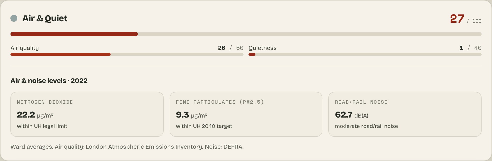
Prices, rent & a 30-year trend — £/ft², not just asking prices.Every school in the ward, its Ofsted rating and inspection history.Crime by type with a monthly trend — is it rising or falling?Air & noise levels (NO₂, PM2.5, dB) against WHO / UK guidelines.
Simple pricing
Browsing London is free. No account, no cookies, no ad tracking — pay only when you want the deep data behind a decision.
WAYB+
£6.99/mo
For a search that runs over weeks, not a day.
✓Everything in the Day Pass — kept on for your whole search
✓'What's changing here' on every ward: new approvals, venue openings & closures, score shifts
Day Pass vs WAYB+. The Day Pass unlocks everything for a day — every area, your whole shortlist. WAYB+ is everything in the Day Pass kept on month to month for a longer search, plus a ‘what’s changing here’ feed on every ward (new approvals, venue openings and closures, score shifts).
Pockets, wards and boroughs
The map is coloured pocket by pocket. A pocket is a small area of roughly 1,500 residents — statisticians call them LSOAs — and London has 4,994 of them. Pockets are the finest unit we score: the map and side-by-side comparisons work at pocket level.
A ward is the electoral neighbourhood those pockets sit in — 684 across London, each home to 5,000–15,000 residents and typically 7 pockets, up to 14. Ward pages, the wizard and the rankings work at ward level: a ward’s score is the average of its pockets’ scores.
That averaging matters: a ward page shows averages across its pockets, so a specific pocket can score above or below it. Click the map when you care about one spot; read the ward page for the neighbourhood picture. Boroughs — the 33 councils wards belong to — organise the city for browsing. A borough is never scored in its own right: any borough figure you see is an average of its wards’ scores, not a separate measurement.
What it is not
WAYB is not estate-agent, legal, or financial advice, and not a guarantee that a specific property exists at a specific price. It is a decision-support tool for narrowing London down to places worth visiting properly.
Important limitation
Scores are a starting point, not a verdict. Always check the street, your actual commute, property condition, flood and planning specifics, school admissions, and affordability before making a decision.